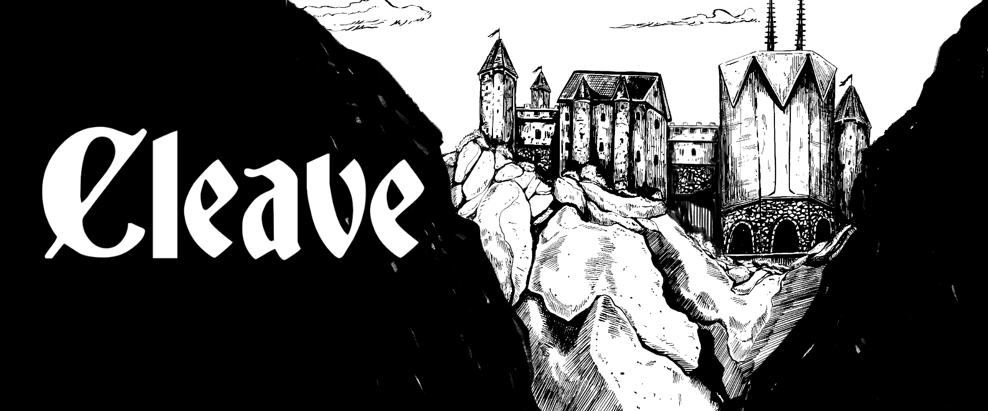
Have only seen the first page so far, but... am I just imagining that the sword-like "L" in the title is a bit darker and sharper than the other letters spelling "Cleave"? Because emphasizing a blade-shaped letter dividing a word into two parts around it when the word is Cleave is some subtle but first class visual design.
← Return to game
Comments
Log in with itch.io to leave a comment.
Have only seen the first page so far, but... am I just imagining that the sword-like "L" in the title is a bit darker and sharper than the other letters spelling "Cleave"? Because emphasizing a blade-shaped letter dividing a word into two parts around it when the word is Cleave is some subtle but first class visual design.
I wish I could tell you that was intentional, and though I did mess with the “L” in some variations, this current version just uses a regular “L”.
(I tried making it a sword. It was a bit much)
I appreciate the idea though. I may play around with that.
Weird, I swore I could see a difference! Maybe an artifact of the way pixels render straight lines vs. curves?
Rest of the book is great so far too, BTW!
Quite possibly. Thanks so much for checking it out!